

When CFOs read about Anthropic’s Claude Dashboards… You’d think, why do I wait two weeks for a BI change?
It’s a fair question.
It’s also the wrong one. The better question is, if anyone can build a dashboard in minutes, whose number goes in the board pack?
I spent this morning with the new Claude Dashboards.
Here’s what it does, what I built with it, and where an enterprise CFO should slow down.
Claude Dashboards turns a plain-language question into a live dashboard.
You connect to a data platform such as Amazon Redshift, BigQuery, ClickHouse, Databricks, or Snowflake. You ask a question. Claude writes the queries, builds the charts, and keeps them current as the data changes.
It also works with other connectors, so a dashboard of Salesforce opportunities is fair game.
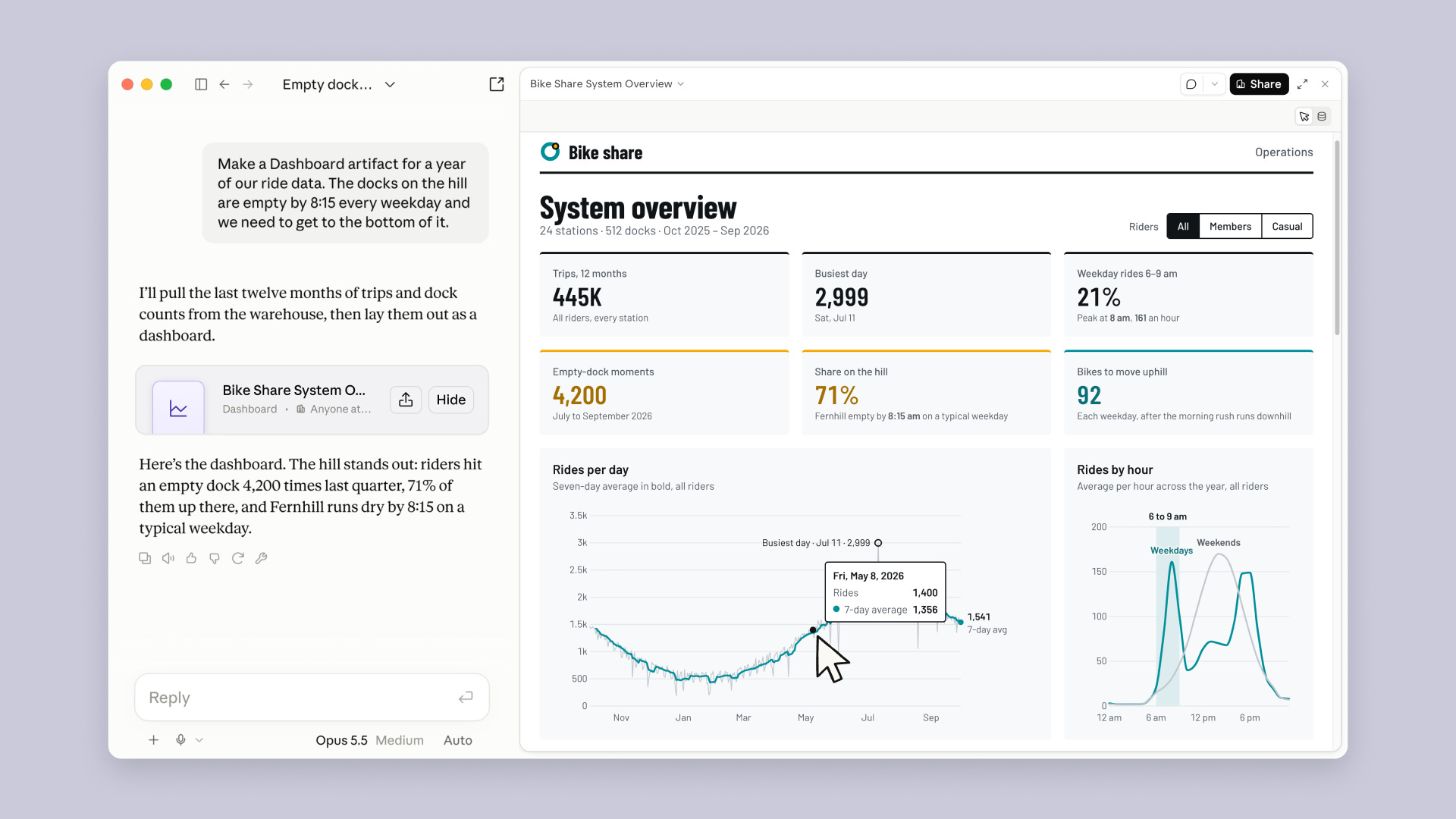
It’s in beta on paid plans: Pro, Max, Team, and Enterprise, per the Claude Help Center.
3 reasons why a CFO should care
There are three features that map straight onto finance frustrations.
The BI queue.
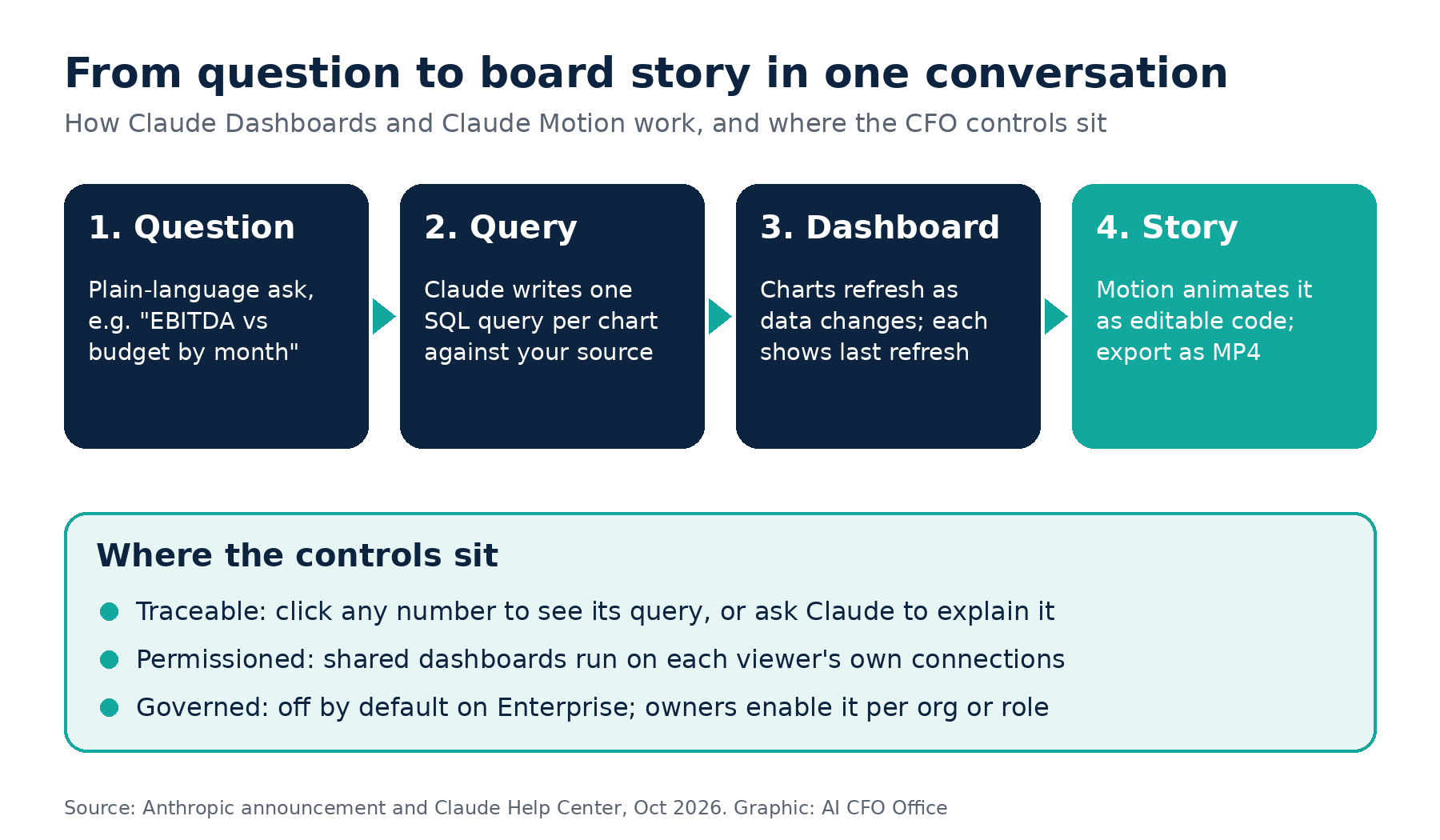
Today, a new cut of the numbers means a ticket, a data analyst, and a wait. Dashboards moves the first version to the person asking. Anthropic pitches it for quick, exploratory questions. That’s exactly the backlog that clogs finance teams.
“Where does this number come from?” Every chart shows the SQL query behind it and when its data last refreshed. Click any number to see its query, or ask Claude to explain it in plain English. For a CFO, that’s the difference between a pretty chart and an auditable one.
“Why does sales see a different number?” When you share a dashboard, it runs on each viewer’s own connections. Anthropic’s sharing guide is direct: if a viewer can’t access a data source, that chart shows an error instead of your data. Two people can open the same dashboard and see only what their access allows.
Let’s dive in.
How to use Claude Dashboards as a CFO
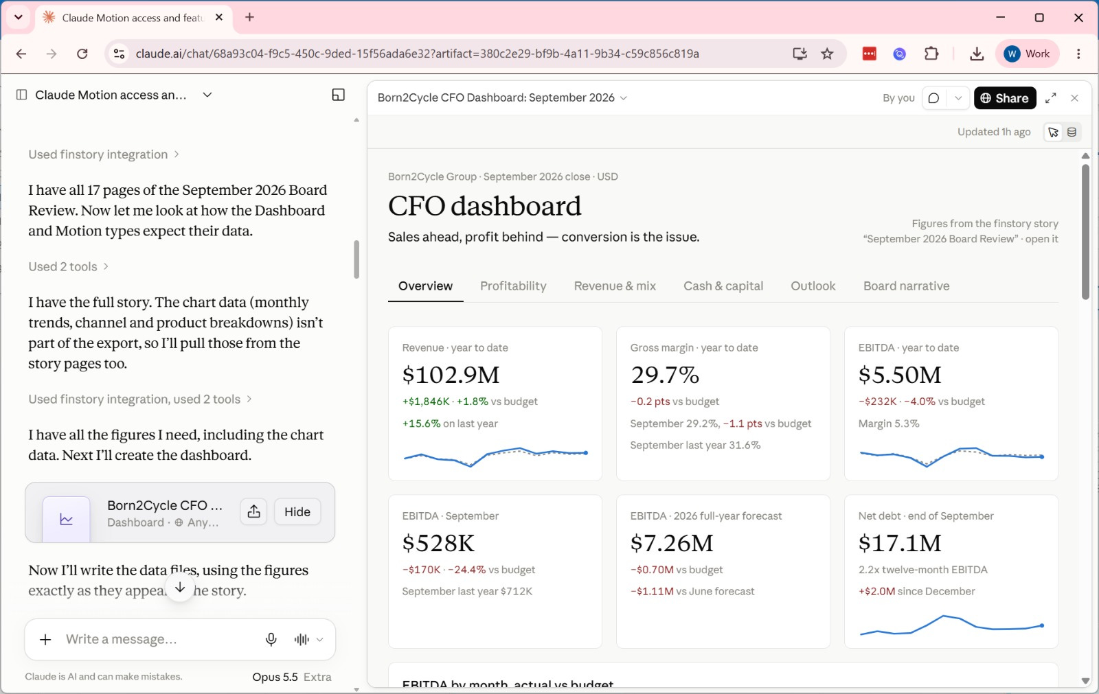
Before we start, take a look at the dashboard I just built.
Let’s move on and build a CFO dashboard.
I opened with this prompt; it connects live with my ERP: